Performance Dashboard
The Pulse Performance Dashboard gives you a unified view of how your content is performing. It combines metrics from all sources (GA4, CSV, manual entry) into a single interface.
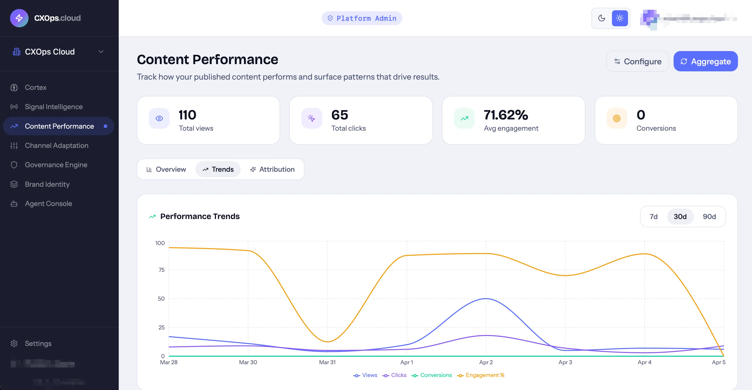
Dashboard Layout
Section titled “Dashboard Layout”Stat Cards
Section titled “Stat Cards”At the top, summary cards show aggregate metrics across all tracked content:
- Total views
- Total clicks
- Average engagement rate
- Total conversions
Trends Chart
Section titled “Trends Chart”The main visualization is a time-series chart showing metric trends over time:
- Toggle metrics — click legend items to show/hide individual metrics
- Date range — filter to specific time periods
- Hover — see exact values at any point in time
The trends chart makes it easy to spot patterns — traffic spikes, engagement drops, conversion improvements — and correlate them with content changes.
Content Table
Section titled “Content Table”Below the chart, a table lists each tracked URL with its metrics:
| Column | Description |
|---|---|
| URL | The content page |
| Title | Page title |
| Views | Total page views |
| Clicks | Click events |
| Engagement | Engagement rate |
| Conversions | Goal completions |
| Source | Where the data came from (GA4, CSV, manual) |
| Measured | Date of measurement |
Attribution
Section titled “Attribution”The attribution view links content performance back to its origin:
- Which signal inspired this content
- Which Cortex project generated it
- When it was published and through which channel
This connection lets you evaluate the ROI of your content operations — from signal detection through performance measurement.
Using the Dashboard
Section titled “Using the Dashboard”Identifying Top Performers
Section titled “Identifying Top Performers”Sort the content table by any metric to find your best-performing content. High performers are candidates for:
- Adapting to additional channels via Adapt
- Creating follow-up content on the same topic
- Updating and re-optimizing for continued performance
Spotting Underperformers
Section titled “Spotting Underperformers”Filter for content that’s below your goal thresholds. Underperformers may need:
- SEO re-optimization in Cortex (consider enabling auto-optimize)
- A content refresh with updated data or angles
- Promotion through additional channels
Tracking Goal Progress
Section titled “Tracking Goal Progress”Compare actual metrics against the goals you set in Pulse configuration. The dashboard highlights where you’re meeting, exceeding, or falling short of targets.
Reporting Frequency
Section titled “Reporting Frequency”Your Pulse configuration determines how often metrics are aggregated:
- Daily — see performance changes day by day
- Weekly — weekly rollups for broader trends
- Monthly — monthly summaries for executive reporting
GA4 syncs happen based on this frequency, and the trends chart granularity adjusts accordingly.